The Bauhaus
The Bauhaus school was opened in 1919 by Walter Gropius, whereby artists and creatives could all learn their trade under one roof. It was based on the fundamental principles of design underpinning all art forms, and was designed around “form following function.” The architecture and style was asymmetric and everything was made of glass, steel and concrete. There were no decorative items that were not needed for the school to function properly. Their graphic design was based around geometric shapes and simplification. They used type was rational, geometric and sans serif. They created a typeface which had no associations with the Nazi’s or other German themes. It was a thick, sans-serif, lower case-only font with a rounded shape, named “Universal.”
Obama Poster
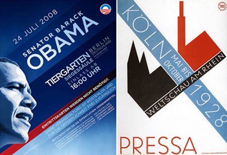
The poster on the left is for Obama’s visit to Berlin in 2008. The poster on the right is an original Bauhaus advertisement from 1928. Comparing the two, you see the same use of diagonal orientation and lines, giving the text a new direction. They both have a strong, yet reasonably narrow, sans-serif font and use the same colour palette. The 2008 Obama poster is vastly modernized and less stripped-back and simplistic, but it follows the same theme. The image of Obama himself is simplified to monochrome colours and less detail than a photograph. The use of gradients in the new poster in unlike the Bauhaus design, but technology and materials have advanced to allow these kinds of contemporary effects. They both also have a round logo in the top right corner, keeping the layout very consistent.
Coca-Cola Advertisement
This modern-day Coca-Cola advertisement has also taken inspiration from Bauhaus design. It uses the diagonal orientation of text, as well as simplifying shapes into block colours and combining diagonal lines with circles. The use of the lines leads the eye down the page, and is also a main feature in a lot of Bauhaus designs, along with circular shapes. They have used a very rounded sans-serif font, similar to “Universal” and brought in the simplicity of contrast and kept to a palette of just 3 colours. The Advertisement on the right is a lot more simplified, like typical Bauhaus advertising, but both have been influenced by the style.

